
UI & UX micro-tips: 8-bit anniversary edition
A collection of 36 powerful tips to help improve your designs instantly
To celebrate the 5th anniversary of my super-popular UI & UX Micro-Tips, I’ve brought together some of the most timeless tips, and bundled them in an 8-Bit format. Why? Just because :)
When creating efficient, accessible, and beautiful UIs for your SaaS product, sometimes it takes only the smallest of adjustments to significantly boost conversion rates and user satisfaction.
In this super-digestible article, I’ve put together a selection of battle-tested micro-tips that can help SaaS founders and their teams quickly improve both design quality and user experience — without massive design overhauls.
Hope you enjoy the tips!
1. Whitespace is your design friend. Use it to improve your UIs instantly.
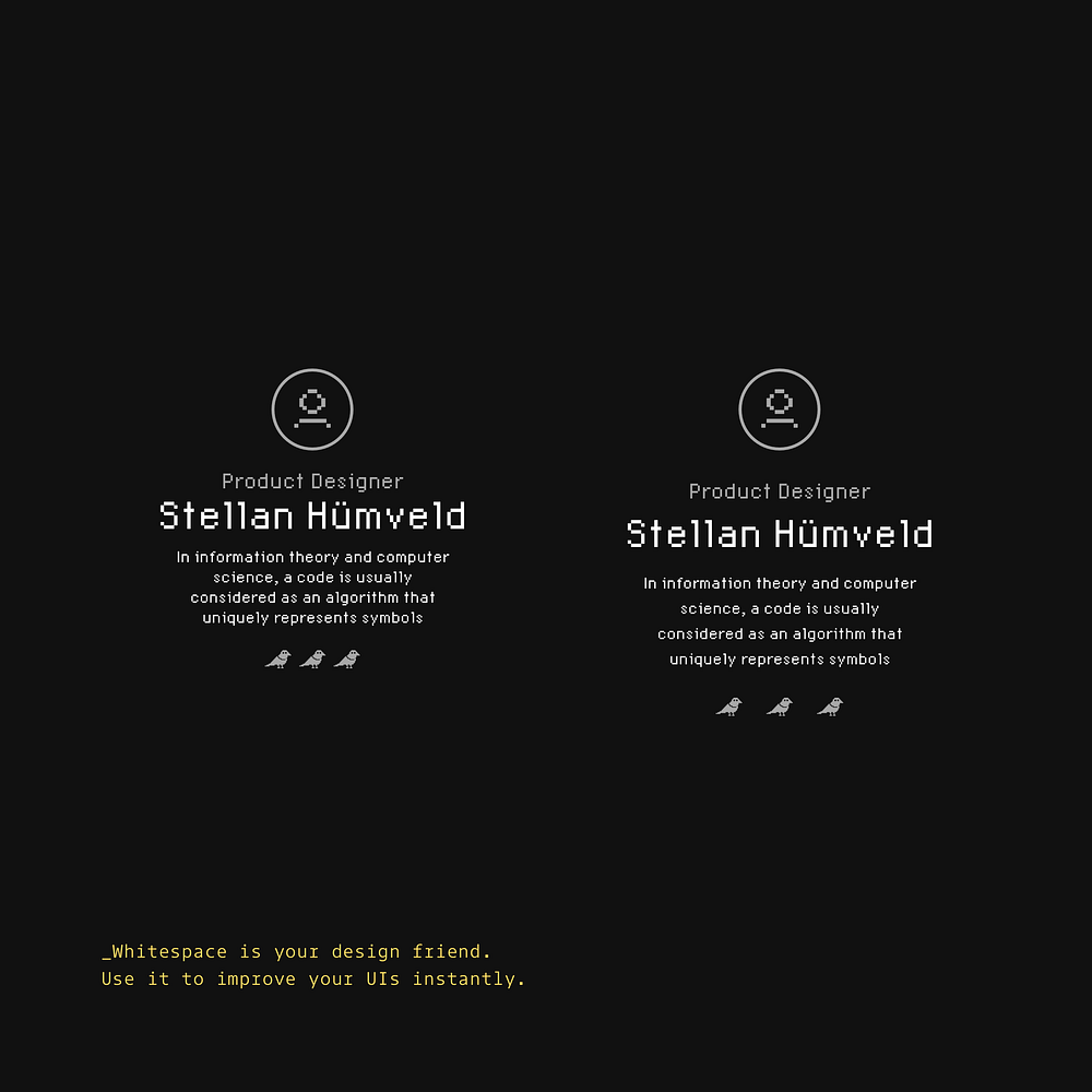
Negative space creates visual hierarchy and improves readability. The right amount of breathing room transforms cluttered layouts into polished experiences.
2. Make sure your text contrasts well. Design for accessibility, not just decoration.

Poor contrast excludes users and strains everyone’s eyes. Aim for proper contrast ratios to ensure your content remains readable for all.
3. Using just the one typeface in your design is all good.

Typography consistency creates harmony and professionalism. A single well-chosen font with varied weights often looks cleaner than multiple competing typefaces.
4. Choose a base colour, and then simply use tints & shades to add uniformity.

Colour harmony comes from thoughtful variation, not random selection. Creating your palette from a single hue results in designs that feel intentional and polished.
5. Reserve one colour for your Call to Action. Be really selfish with those CTAs.
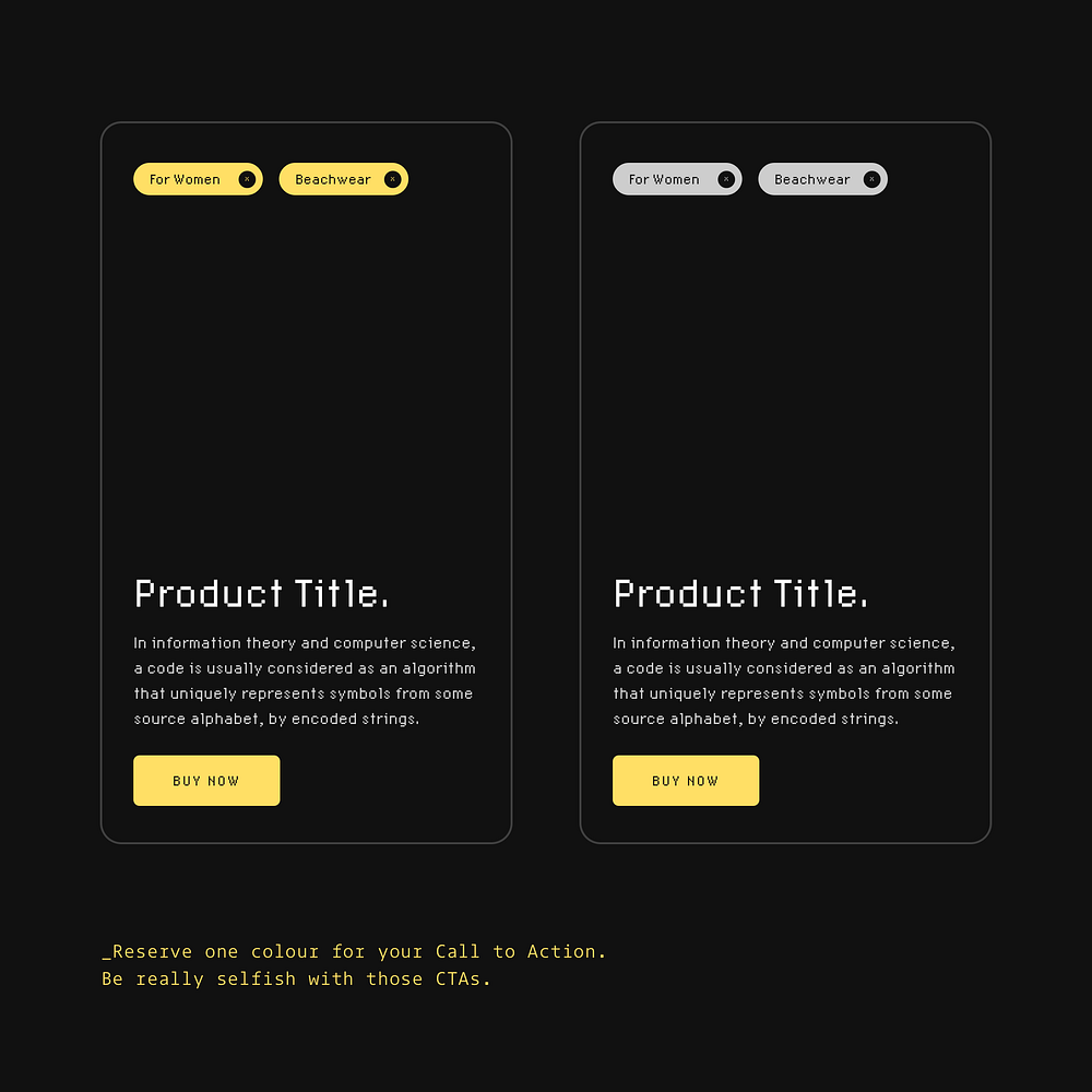
Visual consistency helps users navigate your interface intuitively. Using a specific colour only for clickable elements creates clear visual cues and improves conversion.
6. Don’t have the user second-guessing the next step. Keep them informed at every point in their journey.

Uncertainty creates friction and frustrates users. Adding simple reassurances like ‘Your card won’t be charged yet’ builds trust and keeps people moving through your flow.
7. Give the most important elements on the screen more prominence.
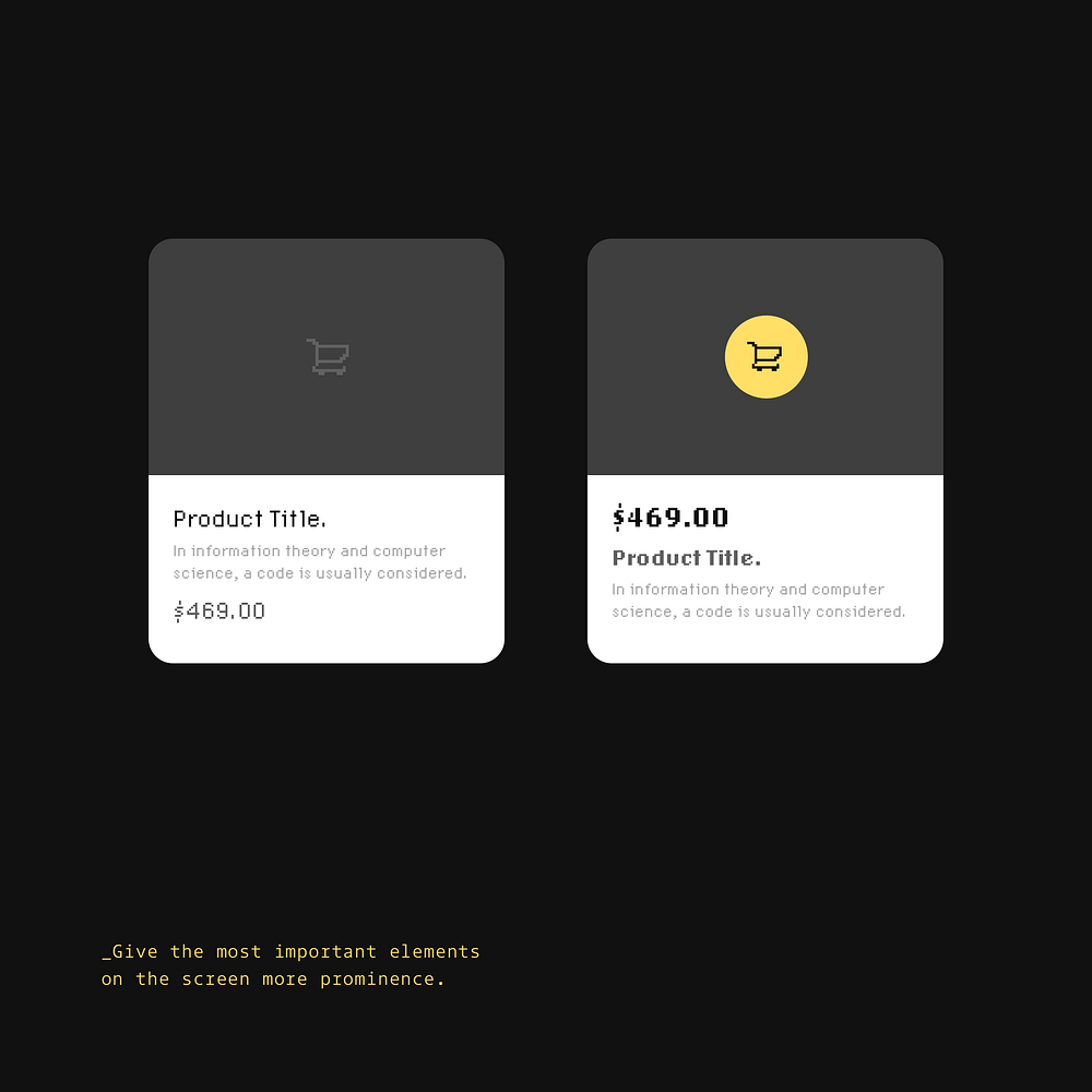
Visual hierarchy guides users to what matters most. Strategic placement and sizing of key elements like prices and action buttons improves clarity and simplifies decision-making.
8. Present your icons with labels for easier comprehension.
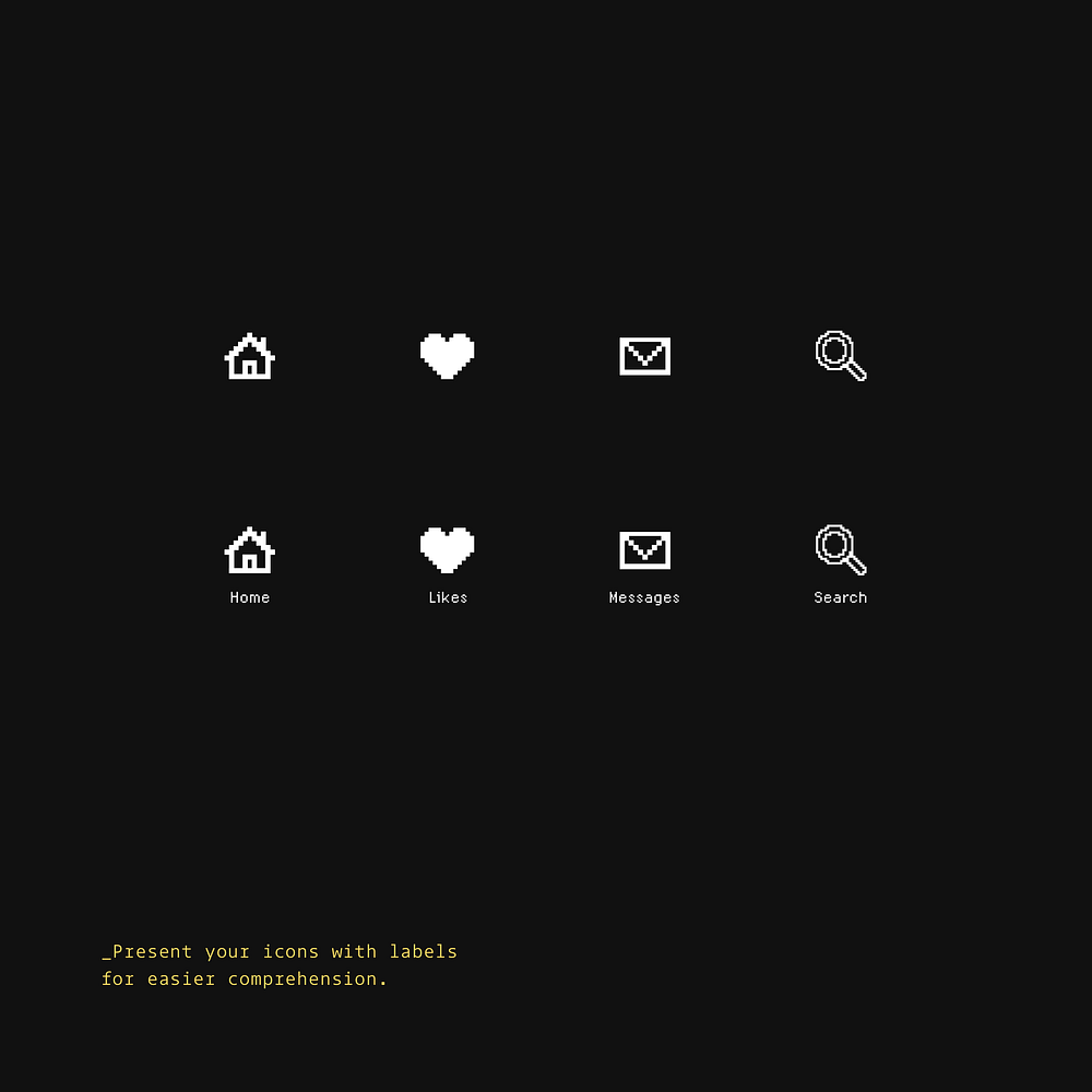
Even ‘obvious’ icons can be confusing without text. Labels remove guesswork and make navigation instantly understandable for all users.
9. Proximity. A key Design Principle. Use it regularly and use it well.

Related elements should live close together. Grouping content spatially helps users understand relationships and improves information processing.
10. Have a content-heavy site? Make that Search a prominent feature.

Don’t bury your search functionality. The difference between a small search icon and a full search bar can dramatically improve user experience on content-rich sites.
11. Inform the user on what’s going to happen if they apply a certain action.
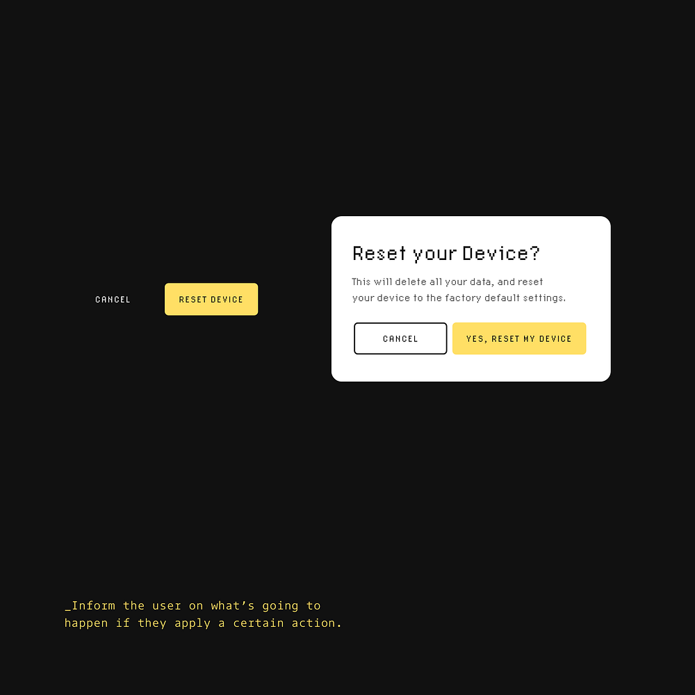
Clarity prevents mistakes and builds trust. Clear consequences help users make confident decisions without fear of unintended outcomes.
12. Assure the user that something is happening when loading up sections of your App.
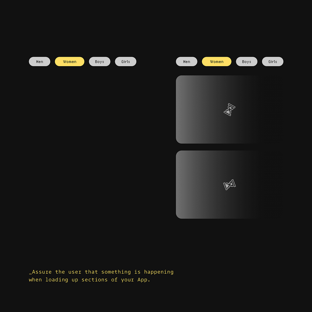
Loading indicators reduce uncertainty and perceived wait time. Small visual cues reassure users that their request is being processed rather than leaving them guessing.
13. It’s all good to reduce the line-height on your headings.
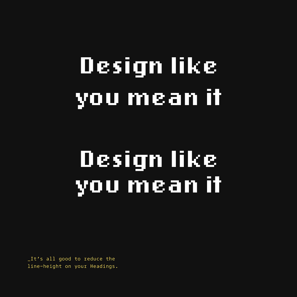
Tighter line spacing on headlines creates visual cohesion. Headlines need less space between lines than body text to appear as unified elements.
14. To improve the optical balance of your headings, reduce the letter-spacing.
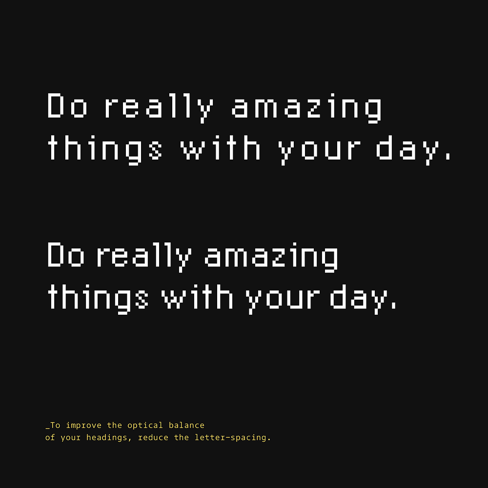
Typography benefits from custom spacing adjustments. Slightly tighter letter spacing in headlines often improves readability and visual harmony.
15. All-caps should only be used for short titles, such as Kickers (they sit above your Headlines).

All-caps text reduces reading speed and comprehension. Reserve uppercase for very short elements like kickers, labels, or buttons rather than main headlines.
16. Use weight, size, and colour to indicate hierarchy within your type.
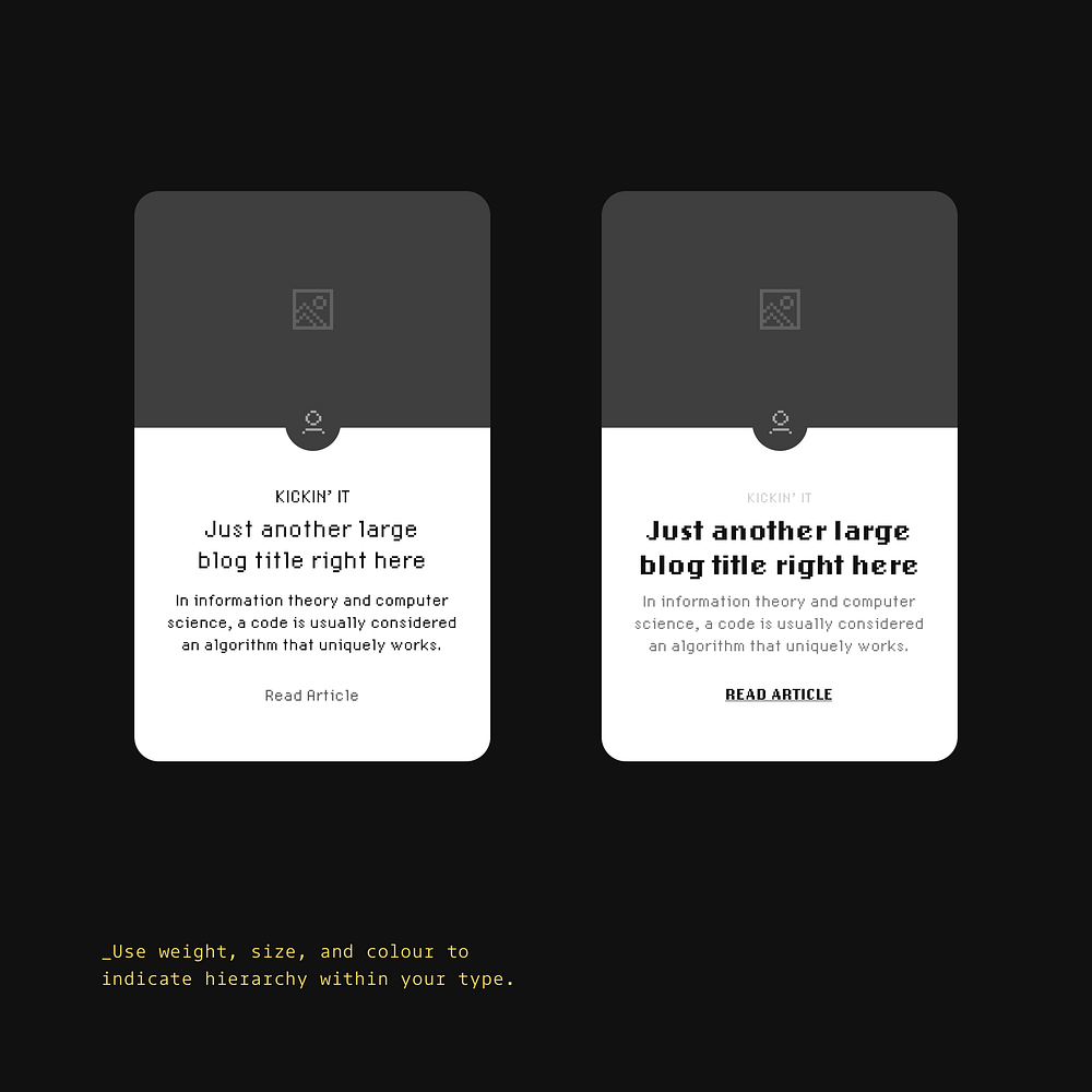
Typographic hierarchy guides users through content in order of importance. Varying these elements helps readers quickly scan and find what matters most.
17. Prompt initial user action with helpful ‘empty states’.

Empty states are opportunities to guide and educate first-time users. Friendly messaging and clear action buttons turn potentially frustrating moments into helpful onboarding.
18. The smaller the font size, the more generous your line-height should be.
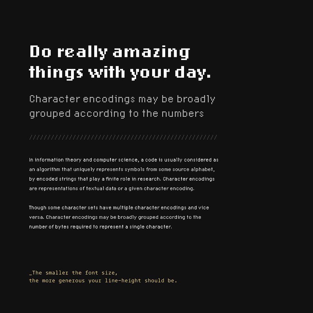
Small text requires extra breathing room for readability. Increasing line spacing as font size decreases makes content more accessible and easier to follow.
Oh. Before you read the rest of the article…
🏠 Growing a SaaS startup? I combine strategic design with proven founder experience to help you build products users love.
Join the Haus waitlist for early-bird perks → https://gohaus.design/
19. Keep your messages short and sweet. Cut out the unnecessary words.
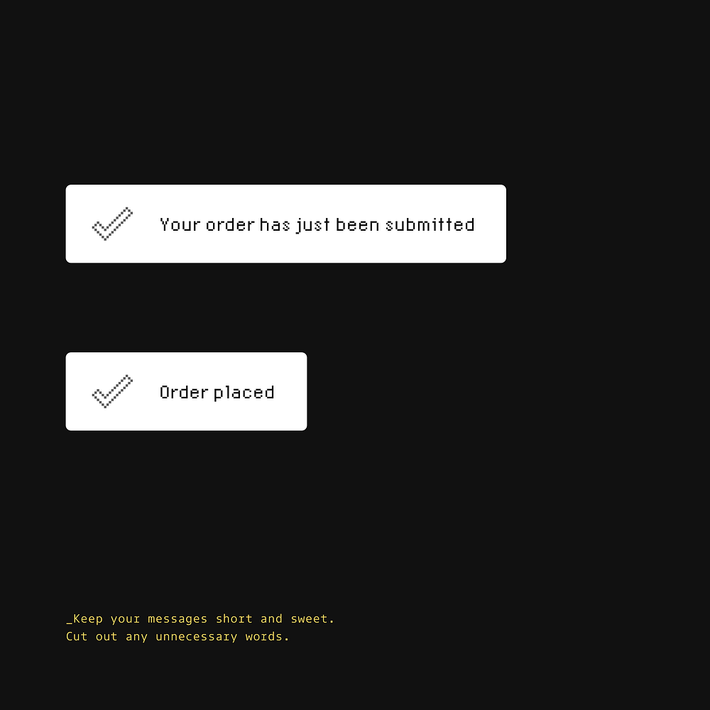
Concise messaging reduces cognitive load for users. Simple, direct communication is easier to understand and act upon than lengthy explanations.
20. Think of Accessibility, and don’t rely on just colour alone to convey error messages in your forms.
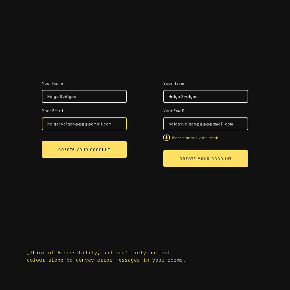
Inclusive design means considering users with colour vision deficiencies. Adding icons and text to error states ensures everyone understands what action is needed.
21. Don’t hide important actions inside of a Dropdown. Keep things front and center people!
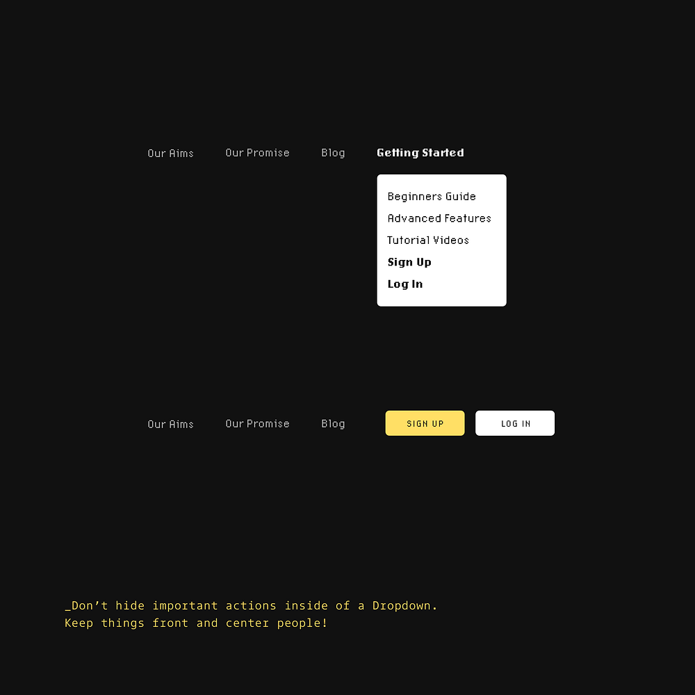
Primary actions deserve prime screen real estate. Moving sign-up and login buttons from a dropdown to the main navigation increases discoverability and conversion rates.
22. Improve your user’s onboarding experience. Keep those taps within easy reach. Thumbs still rule!

Mobile interfaces should accommodate how people actually hold their devices. Positioning key actions in the lower right makes them accessible to thumb-users without uncomfortable stretching.
23. Make sure your shadows are coming from one light source. We don’t live in a land of a thousand suns remember.
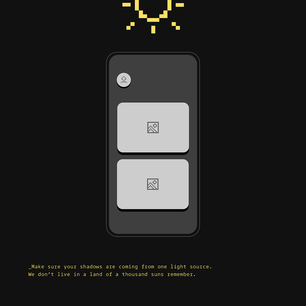
Consistent shadow direction creates a realistic interface. Unified light direction gives depth to UI elements while maintaining a coherent visual experience.
24. Always make your ‘Call to Action’ the most prominent item on the screen.

Primary actions need visual emphasis to guide user behaviour. The right example shows how a prominent, well-positioned button increases clarity and directs user attention.
25. Make Breadcrumbs stand out, and easy to navigate for the user. Show them some love.
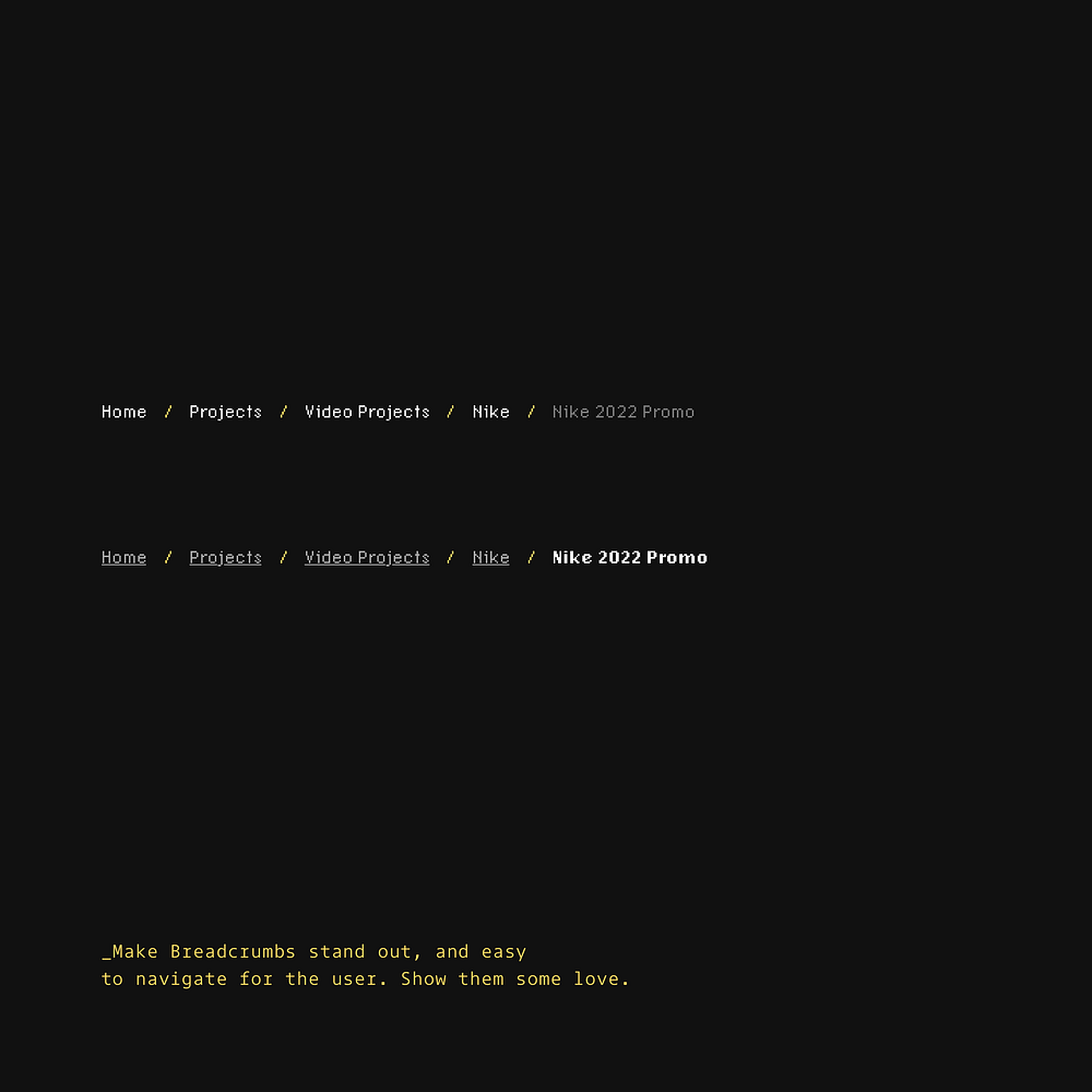
Breadcrumbs help users understand location and navigation paths. Enhancing their visibility and clickability improves site orientation and reduces user frustration.
26. Maximise the Signal-to-Noise ratio. Cut out the noise , and make things clearer.
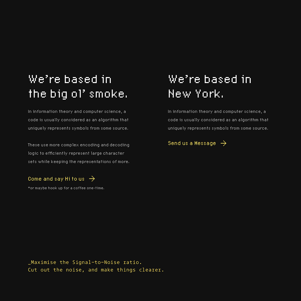
Content clarity helps users find what matters quickly. The right example removes unnecessary text while maintaining essential information and clear calls to action.
27. When working with snippets of text in all-caps, remember… All-Caps + Increased Letter-Spacing = Better Legibility.
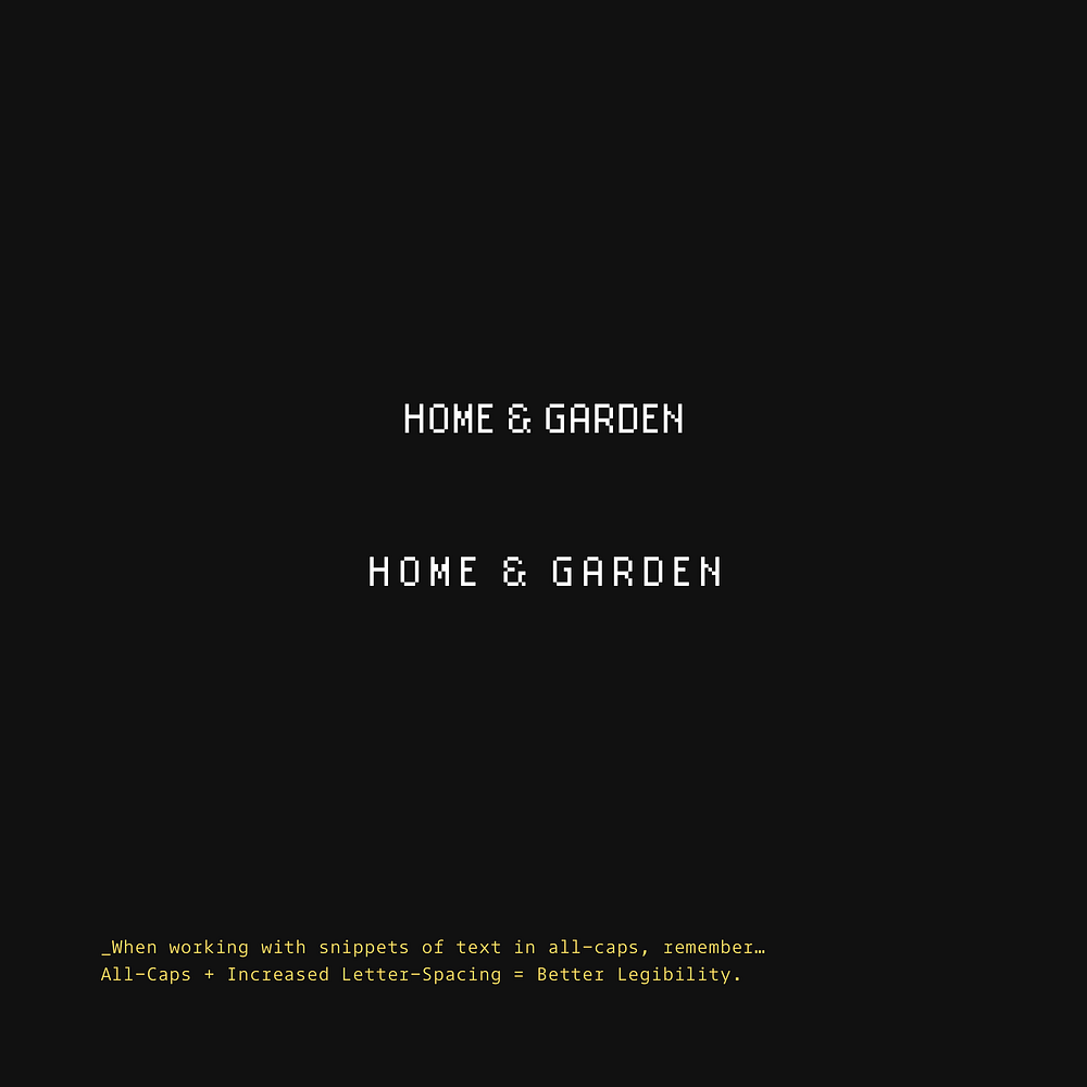
All-caps text can be hard to read without proper spacing. Adding letter spacing to uppercase text improves readability by helping distinguish individual characters.
28. When working with long-form content, style that opening paragraph to draw the user in.

First impressions matter in written content. A properly styled first paragraph guides readers into the content and establishes hierarchy.
29. Try and create generous tappable areas on Mobile. Fingers come in various sizes so give ’em some room.
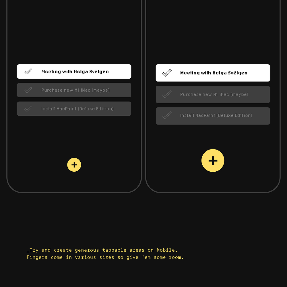
Mobile interfaces need larger touch targets than desktop interfaces. Bigger buttons reduce missed taps and frustration, especially for users with larger fingers or limited dexterity.
30. When describing a goal, and the action required to achieve it, begin the sentence with the goal.
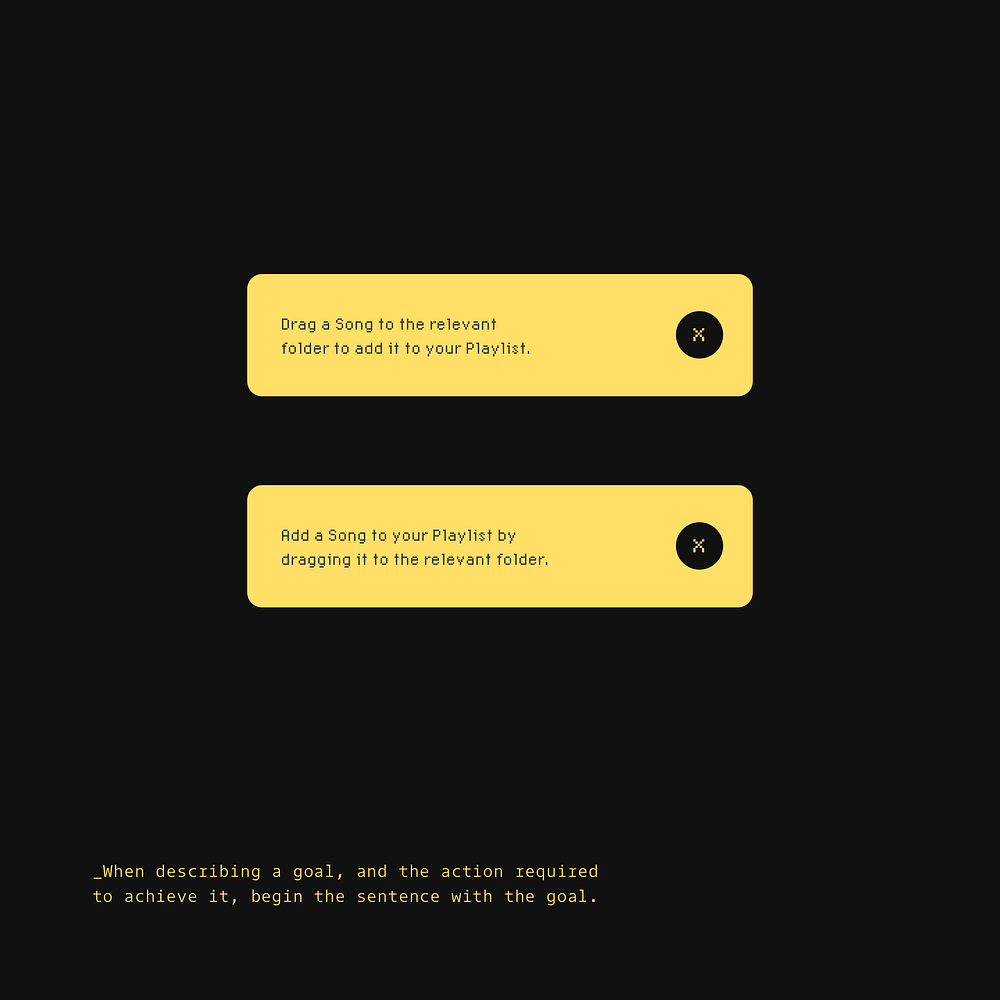
Task instructions are easier to understand when structured properly. Leading with the goal before the action helps users understand the purpose first, making instructions more intuitive.
31. Maintain a suitable contrast ratio between light text and images with a simple overlay.
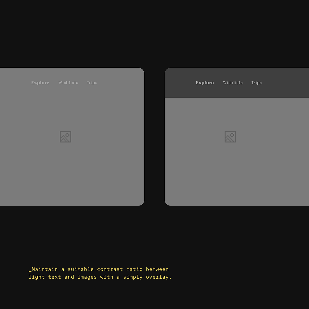
Text legibility requires proper contrast with background imagery. Adding a dark overlay to the navigation area ensures text remains readable regardless of the underlying image.
32. Get your spacing right to achieve the perfect Vertical Rhythm between your Headlines and Body text.
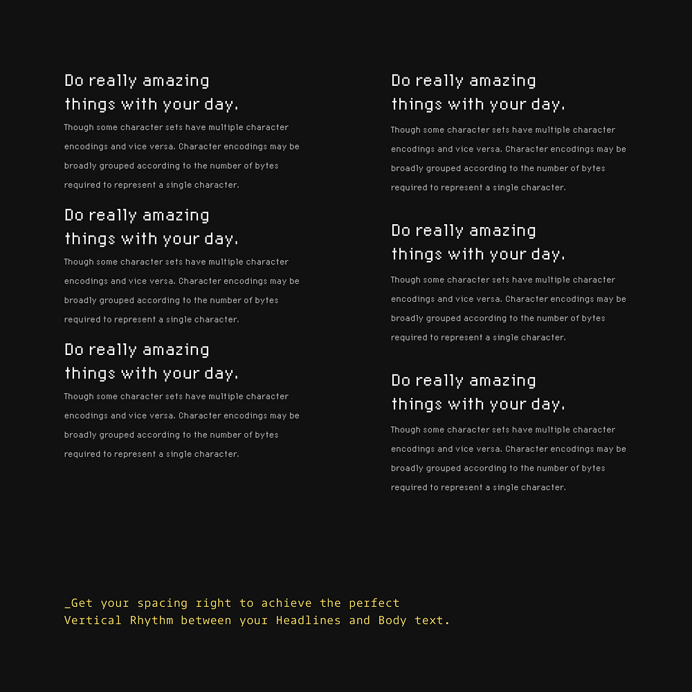
Consistent spacing creates visual harmony in typography. Well-balanced vertical spacing between headlines and paragraphs improves readability and information hierarchy.
33. Always make elements in your UIs easily distinguishable from one another.
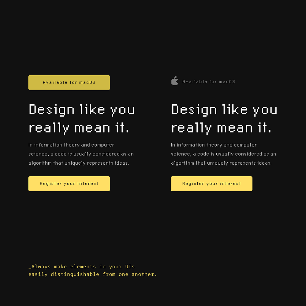
Visual differentiation prevents confusion and speeds up interface scanning. Distinct button styles, icons, and visual treatments help users quickly identify different interface elements.
34. Lower that text contrast, and avoid pure black when working with Dark themes. Go easy on those eyes.
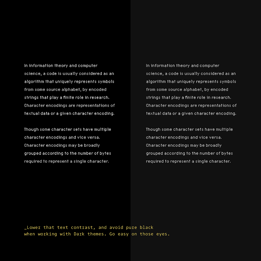
Pure black text on dark backgrounds creates eye strain. Reducing text contrast in dark mode interfaces improves comfort during extended viewing sessions.
35. Use shades of Grey to communicate an element’s elevation effectively when working on Dark themes.
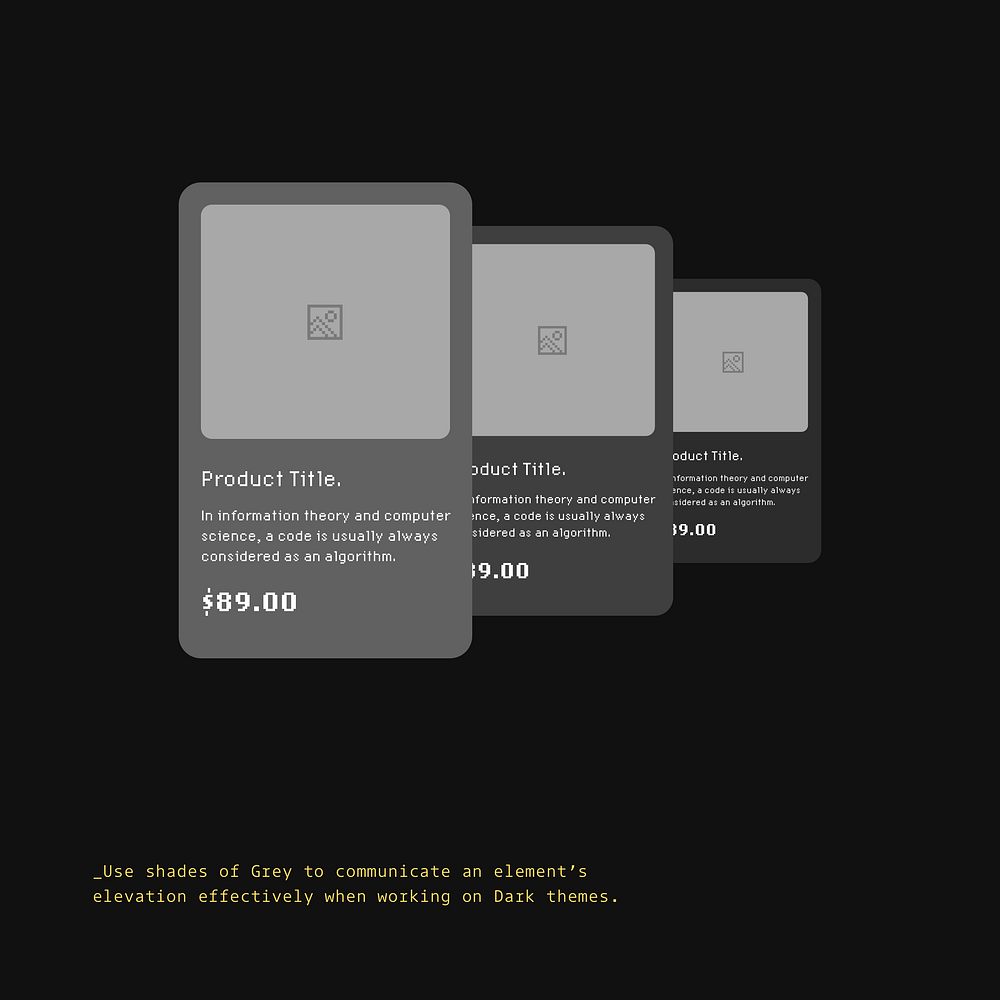
Layering helps create depth in dark interfaces. Different shades of grey create a clear sense of dimension, helping users understand spatial relationships between elements.
36. Use complementary border radiuses. Avoid making things look a little ‘off’.
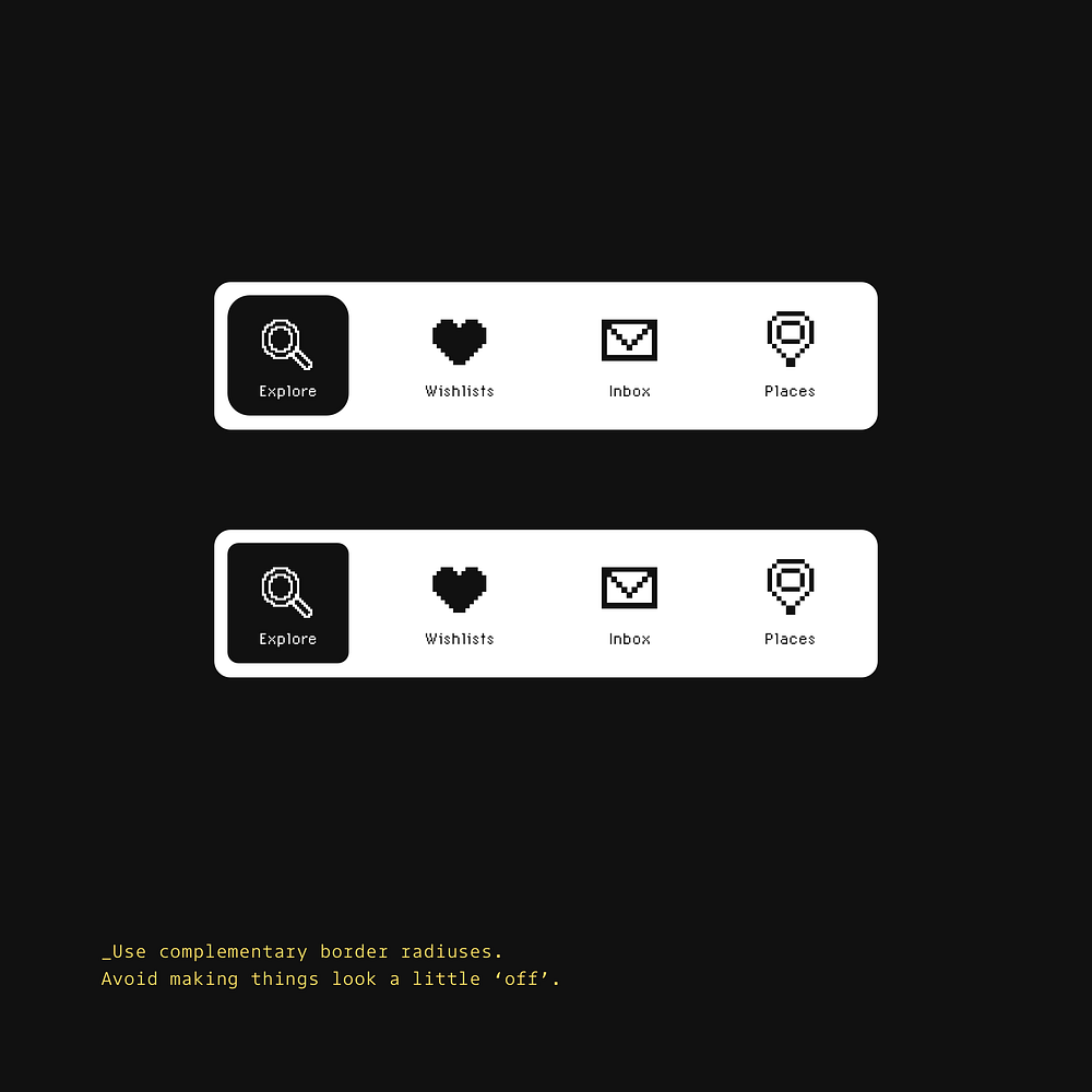
Consistent corner rounding creates visual harmony. Maintaining uniform border radius across related elements helps interfaces feel polished and intentionally designed.
I hope this collection of micro-tips has shown you how seemingly minor design adjustments can produce measurable results for your SaaS product — from improved user engagement to higher conversion rates.
As founders, we’re constantly balancing resources. The beauty of these tips is that they offer high ROI for minimal effort, letting you create more polished experiences without derailing your development roadmap.
Thanks for reading,
Marc.
Oh. Before you go… 🚀
Building a SaaS? I’ve designed products that converted to 6-figure exits. Join the Haus waitlist to get design that actually drives growth, not just looks pretty → https://gohaus.design/

