UI & UX micro tips: best of the best
In this article I’ve compiled 10 of my most popular UI & UX Tips

When creating efficient, accessible, and beautiful UIs, it takes only the tiniest of tweaks to improve your designs.
Here I’ve compiled 10 of my most popular UI & UX Tips that can, with little effort, help improve both your designs and the user experience.
Let’s check them out…
Oh. Before you read the rest of the article…
🏠 Growing a SaaS startup? I combine strategic design with proven founder experience to help you build products users love.
Join the Haus waitlist for early-bird perks → https://gohaus.design/
1. How darkening your Text can improve Readability.
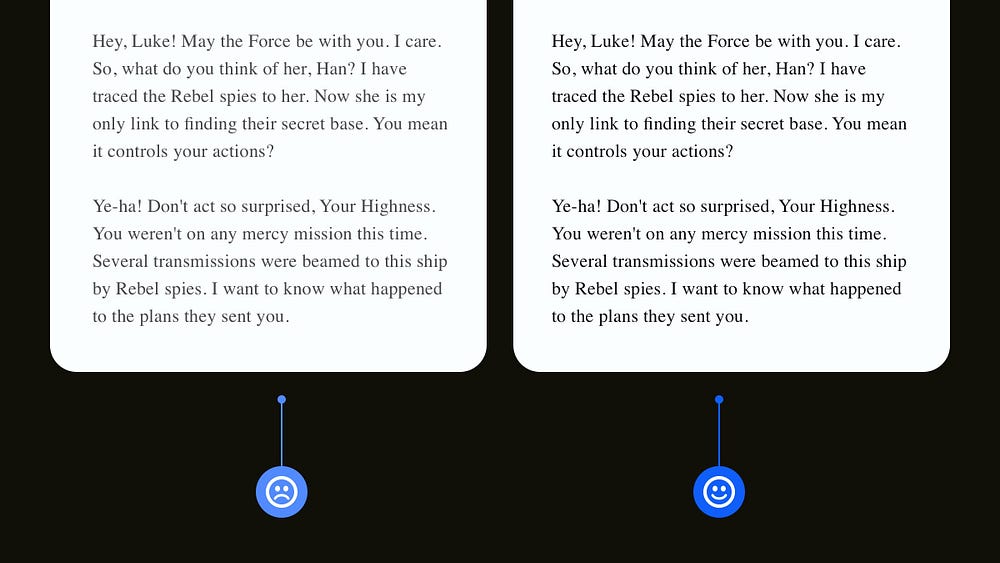
When it comes to long-form content, you may be inclined (because all the cool kids are doing it) to go with a mid-shade of Grey, which can be all good until you start using a lighter font-weight, affecting legibility in a big way on screens of all sizes.
Don’t have users with reduced vision reaching for the back button, and quickly fix this issue by darkening the text and making it more accessible to everyone.
With Typefaces that have a lighter weight, just darkening things down a few notches can significantly improve their legibility.
2. Why placing Labels above Fields is best practice for lengthy Forms.
Ok. For short forms, following the familiar eye-scanning Z-Pattern and placing labels to the left of the field is acceptable as there’s not much content to scan through, but for longer forms, always keep those labels at the top.
Having those longer forms use the more common F-Pattern allows the user to scan the form more naturally and achieve their goal quicker.
Don’t build those longer forms purely with aesthetics in mind when you aim to get the user through it with the least friction.
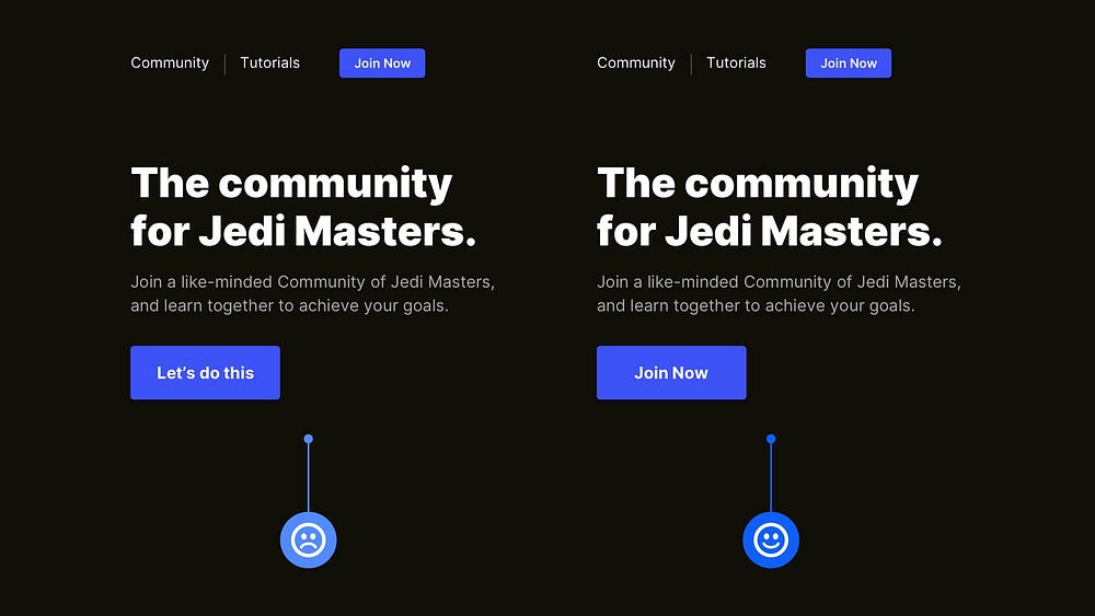
3. The importance of clear and consistent Button Labels.
Firstly, you should always try to give descriptive labels to your buttons describing the next step when the user taps that lil’ button. Secondly, and something that gets neglected, is to keep consistent and clear with the button label naming throughout your site or app.
I’ve often seen (and been guilty of it myself) inconsistent, sometimes vague labelling for buttons that involve the same action. ‘Join Now’, ‘Let’s do this’. Same action. Different Labels. Try to avoid it.
Keep your labels consistent throughout. Reduce the cognitive effort (however small) for the user and let them achieve their goals without second-guessing.
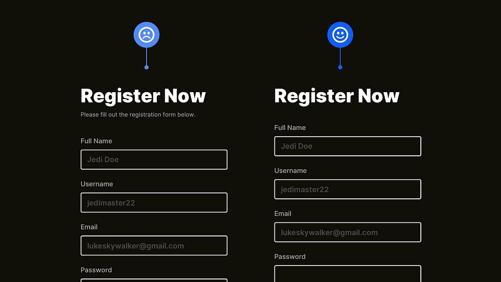
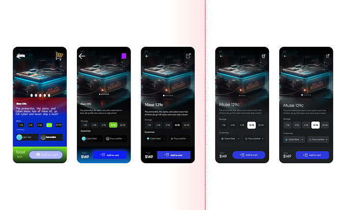
4. The benefits of removing unnecessary words from your UIs.
Our goal is to get the user from point A to point B in the quickest time possible, and avoiding unnecessary words is one of the simple ways you can achieve that.
If the action they must take (filling out a form and signing up for your service) is pretty obvious, a simple title, i.e. ‘Register Now’, is more than enough to guide them forward.
There’s nothing wrong with hand-holding the user occasionally, but when something’s self-explanatory, and you want the user to achieve their goal quickly, you can go ahead and cut out those unnecessary words.
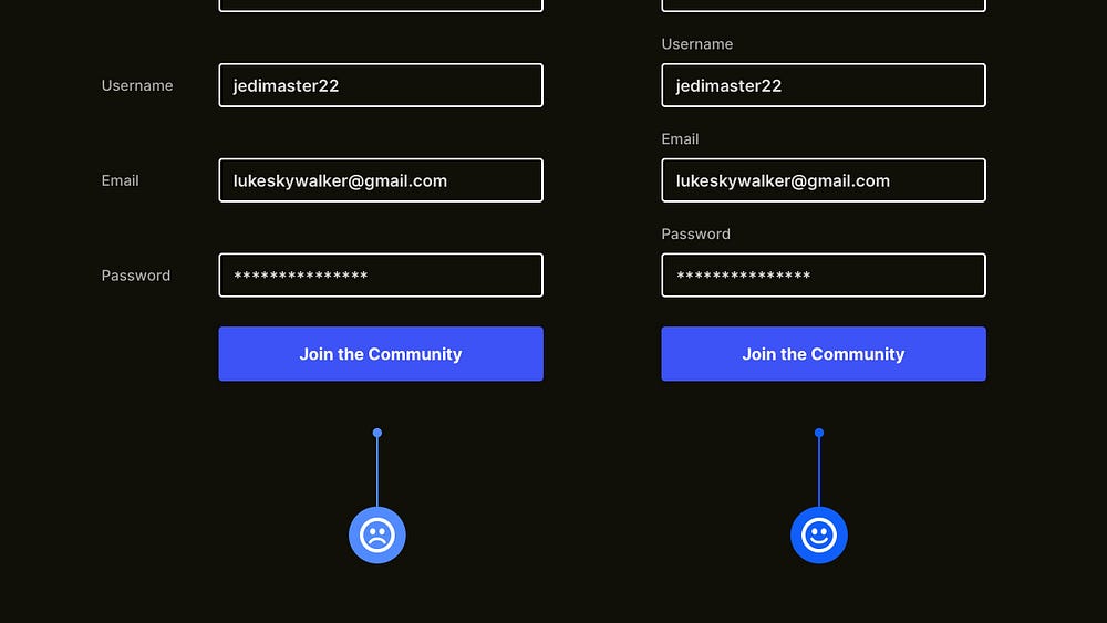
5. Why instant feedback is crucial for Form interactions.
When it comes to Forms, especially those consisting of quite a few input fields, it can be encouraging for the user to see instant feedback as they make their way through it.
Just keep it simple. Nothing too fancy. Just keep users in the loop whether an interaction with a specific field was successful or not.
A simple icon and, in some cases, a short text hint are all that’s needed to provide much-improved accessibility and just a general improved user experience when it comes to Forms.

6. Ensure users always know what’s coming next.
Before a user takes action, especially on some types of Calls to Action, ensure they’re not left in the dark about what may happen next.
Always keep the user well informed before an action is taken as to what they can expect when clicking on your shiny Call to Action.
Improve the user’s experience every step of the way, and don’t leave them second-guessing at any point in their journey.

7. Reduce user friction and reserve one colour for your Call to Action.
The Call to Action (CTA) must be one of, if not the most crucial element on the screen.
Don’t have the user confuse it with any other kind of element on the screen (i.e. Notifications or Tags). It needs to be easily distinguishable between those elements, and that can be achieved by simply reserving one colour for the CTA and nothing else.
Of course, you can go further with sizing, shape and more, but reserving that one colour for your CTA and alone can reduce most friction.
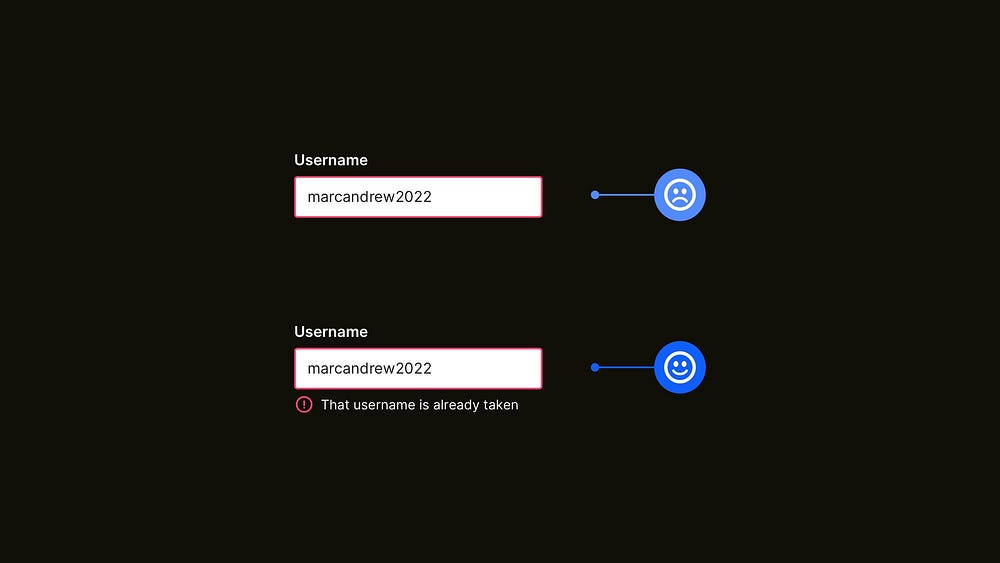
8. Communicate error states in Forms without relying solely on colour.
Regarding Accessibility with your Forms, don’t rely on colour alone to communicate different states to the user.
For example, with Error states, if you only communicate an issue with colour alone, someone with colour blindness may completely miss this. That’s not cool.
Always try to incorporate a combination of icons and some form of error message to aid Accessibility and not leave many users in the dark about the issue that’s being communicated to them.
9. How lowering text contrast can help users with visual impairments.
This tip applies to me on a much more personal level. I suffer from a condition called Astigmatism, so working on and viewing a Dark themed design can be troublesome sometimes, with an effect called Halation coming into play.
So when pure white text is set against a pure black background, the text can appear (to me personally) to have a strange kind of ‘shimmering’ and ‘haloing’ effect, which makes things particularly troublesome when viewing Dark text-heavy sites or apps.
To improve things for users with Astigmatism (of which there are many more than I realised), setting your White text to around 85–90% opacity (and avoiding those pure black backgrounds) can improve things significantly for users with this condition.

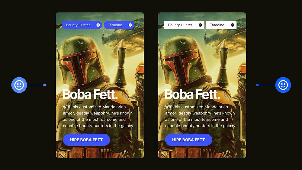
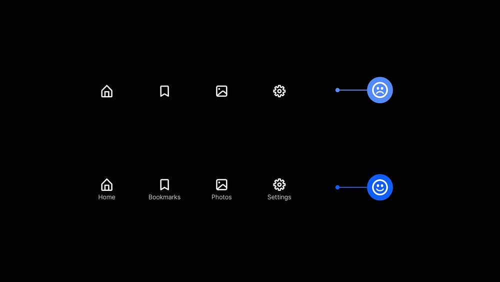
10. The benefits of using Icons and Labels together.
Try not to leave those Icons all by themselves. For the benefit of your users, they need some company in the form of Labels.
In some circumstances, you can get away with a sneaky lone icon (Search function, anyone?). Shhh! We won’t mention Hamburgers here.
But for Primary Navigation elements, it aids usability and brings easier comprehension to have a Label alongside its accompanying Icon and not have the user second-guessing things.
Hopefully, you can see that by making minor tweaks to your designs, you can easily create more efficient, accessible, and beautiful UIs that greatly enhance the user’s experience.
Oh. Before you go…
🧠 Looking for a mentor who can help improve your design skills 10X? Let’s chat. Tap into my 25+ years of experience and take your journey to the next level → https://marcandrew.me/mentoring


