UI & UX micro-tips: Volume fifteen
A collection of handy tips to help improve your designs instantly

When creating efficient, accessible, and beautiful UIs, it takes only the smallest tweaks to improve your designs.
In this follow-up article I’ve brought you another selection of easy to put into practice UI & UX micro-tips.
Tips that can, with little effort, help improve both your designs, and the user experience.
Let’s dive on in…
Oh. Before you read the rest of the article…
🏠 Growing a SaaS startup? I combine strategic design with proven founder experience to help you build products users love.
Join the Haus waitlist for early-bird perks → https://gohaus.design/
1. Help the user get to relevant content in the quickest way.

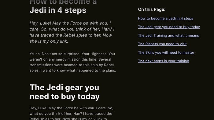
In-Page links (sometimes referred to as Jump links) have in the past been frowned upon by certain sections of the UX community. Still, if they’re implemented well, they can significantly improve the user experience when it comes to lengthy content on a single page.
Say, for example, on a very long article, and I’m talking one with many sections, each with plenty of content inside, having a table of contents of some kind can help the user navigate to the section they need fast without endless scrolling to find that point of interest for them.
Applied well, In-Page links can provide quick access to the content of interest for the user and much improve discoverability and engagement with your content.
2. Keep consistent, and clear with your button labels throughout.

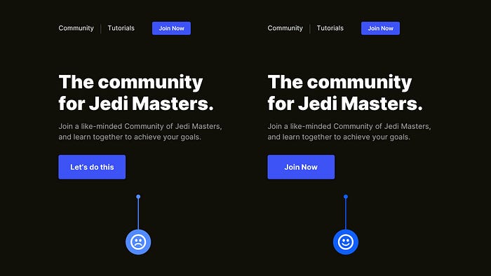
Firstly, you should always try to give descriptive labels to your buttons describing the next step when the user taps that lil’ button. Secondly, and this is the one that gets neglected sometimes, is to keep consistent, and clear with the button label naming throughout your site or app.
I’ve often seen (and been guilty of it myself) inconsistent, sometimes vague labelling for buttons that involve the same action. ‘Join Now’, ‘Let’s do this’. Same action. Different Labels. Try to avoid it.
Keep your labels consistent throughout. Reduce the cognitive effort (however small) for the user and let them achieve their goals without second-guessing.
3. Try to minimise redundant tasks when it comes to longer forms.

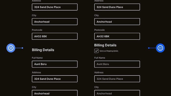
Some forms can get pretty long, especially when it comes to E-commerce and those that involve the user’s shipping and billing details.
Make things a little more streamlined for the user and minimise redundant tasks, such as inputting details for both a delivery address and billing address, which will be the same in most cases.
So make it much less time-consuming for the user with something as simple as a checkbox that allows them to duplicate their previously entered data, pre-populate fields, and move swiftly through your form.
4. Always place the Labels above Fields on longer Forms.

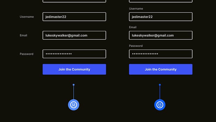
Ok. For short forms, following the familiar eye-scanning Z-Pattern and placing labels to the left of the field is acceptable as there’s not much content to scan through, but for longer forms, always keep those labels at the top.
Having those longer forms use the more common F-Pattern allows the user to scan the form in a much more natural way and achieve their goal quicker.
Don’t build those longer forms purely with aesthetics in mind when your aim is to get the user through it with the least amount of friction.
5. Try not to clutter your UIs with unnecessary words.

Our goal is to get the user from point A to point B in the quickest time possible, and avoiding unnecessary words is one of the simple ways you can achieve that.
If the action they have to take (fill out a form and sign up for your service) is pretty obvious, a simple title ie; ‘Register Now’, is more than enough to guide them forward.
There’s nothing wrong in hand-holding the user from time to time, but when something’s self-explanatory, you can go ahead and cut out those unnecessary words.
6. Avoid the ‘super-minimal’ look with certain UI elements.

When it comes to certain UI elements, especially something like Download Indicators, and however tempting it may be, it’s not always wise to go with the super minimal look, especially on Desktop.
Try to make those lil’ indicators as informative and interactive as possible, which can be achieved simply via the use of colour, a percentage figure (on larger screens, more so) to show the current progress, and a simple icon from where they can cancel the process at any time.
Try and minimise, but not at the expense of the user experience.
Oh. Before you go…
🏠 Growing a SaaS startup? I combine strategic design with proven founder experience to help you build products users love.
Join the Haus waitlist for early-bird perks → https://gohaus.design/

